Getting Started
Installation
Either install via bower or download it
bower install --save mobile-angular-ui
Html head section setup
Distributed package content
| File | Description |
|---|---|
dist/css/mobile-angular-ui-base.css | Mobile only css. it has no media queries except for col-sm-* grid. It also hasn't :hover styles. It is intended to target phones and tablets. |
dist/css/mobile-angular-ui-hover.css | The :hover css rules stripped out from base.css. |
dist/css/mobile-angular-ui-desktop.css | Responsive css. Contains col-md-*/col-lg-* grid along with some pieces of bootstrap.css for components that are only meaningful on large screens (breadcrumbs, pagination..) and a few lines of code to make sidebars always visible. No other responsive stuffs are included from bootstrap.css. |
dist/js/mobile-angular-ui.min.js | mobile-angular-ui itself as well as overthrow.js and fastclicks.js releases. angular.js is not bundled in mobile-angular-ui. |
dist/fonts/fontawesome* | Fonts from FontAwesome icons toolkit |
Setup a mobile only app
<link rel="stylesheet" href="mobile-angular-ui/dist/css/mobile-angular-ui-base.min.css" />
<script src="angular.min.js">
</script>
<script src="angular-route.min.js">
</script>
<script src="mobile-angular-ui/dist/js/mobile-angular-ui.min.js">
</script>
Setup a responsive app
<link rel="stylesheet" href="mobile-angular-ui/dist/css/mobile-angular-ui-hover.min.css" />
<link rel="stylesheet" href="mobile-angular-ui/dist/css/mobile-angular-ui-base.min.css" />
<link rel="stylesheet" href="mobile-angular-ui/dist/css/mobile-angular-ui-desktop.min.css" />
<script src="angular.min.js">
</script>
<script src="angular-route.min.js">
</script>
<script src="mobile-angular-ui/dist/js/mobile-angular-ui.min.js">
</script>
Initialization
You can initialize your Angular application declaring mobile-angular-ui as a dependence.
angular.module('myApp', ["mobile-angular-ui"]);
Here is a more complete example including ngRoute:
angular.module('myApp', [
  "ngRoute",
  "mobile-angular-ui",
]).config(function($routeProvider) {
      $routeProvider.when('/', {
        // ...
      });
      // ...
  });
If you wish you can avoid to load whole mobile-angular-ui modules at all and pick a subset of the loaded modules to fit your needs. This is how the mobile-angular-ui module is defined with its dependencies.
angular.module("mobile-angular-ui", [
  'mobile-angular-ui.pointer-events',     /* prevents actions on disabled elements */
  'mobile-angular-ui.active-links',       /* add .active class to active links */
  'mobile-angular-ui.fastclick',          /* provides touch events with fastclick */
  'mobile-angular-ui.scrollable',         /* polyfills overflow:auto with overthrow */
  'mobile-angular-ui.directives.toggle',
  'mobile-angular-ui.directives.overlay',
  'mobile-angular-ui.directives.forms',
  'mobile-angular-ui.directives.panels',
  'mobile-angular-ui.directives.capture',
  'mobile-angular-ui.directives.sidebars',
  'mobile-angular-ui.directives.navbars',
  'mobile-angular-ui.directives.carousel'
 ]);
Basic Layout
<!-- Sidebars -->

<div class="sidebar sidebar-left" toggleable parent-active-class="sidebar-left-in" id="mainSidebar">
  <h1 class="app-name">My App</h1>

  <div class="scrollable">
    <div class="scrollable-content">
      <div class="list-group" toggle="off" bubble target="mainSidebar">
        <a class="list-group-item" href="#/">Home <i class="fa fa-chevron-right pull-right"></i></a>
        <!-- ... -->
      </div>

    </div>
  </div>
</div>

<div class="app">

  <!-- Navbars -->
  <div class="navbar navbar-app navbar-absolute-top">

      <div class="navbar-brand navbar-brand-center" yield-to="title">
        <span>My App</span>
      </div>

      <div class="btn-group pull-left">
        <div ng-click="toggle('mainSidebar')" class="btn btn-navbar sidebar-toggle">
          <i class="fa fa-bars"></i> Menu
        </div>
      </div>

      <div class="btn-group pull-right" yield-to="navbarAction">
        <div class="btn btn-navbar">
          <i class="fa fa-plus"></i> New
        </div>
      </div>
  </div>

  <div class="navbar navbar-app navbar-absolute-bottom">
    <div class="btn-group justified">
      <a href="#/route1" class="btn btn-navbar btn-icon-only"><i class="fa fa-home fa-navbar"></i></a>
      <a href="#/route2" class="btn btn-navbar btn-icon-only"><i class="fa fa-list fa-navbar"></i></a>
    </div>
  </div>

  <div class="app-body">
      <ng-view class="app-content"></ng-view>
  </div>
</div>
Differences with Bootstrap 3
- It has different mobile-friendly style for default components
- It adds new components like sidebars, absolute-positioned navbars, switches, overlays, scrollables ..
- It does not rely on jQuery or bootstrap.js at all (most of the interactions can be reproduced with [toggle] angular directive)
- It uses font-awesome in place of glyphicons
- Responsive css rules for components -sm,-md, *-lg are moved out of the default bundle
- Responsive grid is divided in two parts:
.col-xs-*and.col-sm-*classes are included in base.css,.col-md-*and.col-lg-*classes are included in desktop.css. - Breadcrumbs and pagination are just not the best way to navigate a mobile app so their are only included in desktop.css.
.containeris always fluid.
Angular Directives
Before going ahead with components you may want to familiarize with some basic mobile angular ui directives.
scrollable
First of all: one thing you'll always have to deal with approaching mobile web app development is scroll and position:fixed bugs.
Due to the lack of support in some devices fixed positioned elements may bounce or disappear during scroll. Also mobile interaction often leverages horizontal scroll eg. in carousels or sliders.
We use overflow:auto to create scrollable areas and solve any problems related to scroll.
Since overflow:auto is not always available in touch devices we use Overthrow to polyfill that.
Markup for any scrollable areas is as simple as:
<div class="scrollable">
  <div class="scrollable-content">...</div>
</div>
This piece of code will trigger a directive that properly setup a new Overthrow instance for the .scrollable node.
toggle and toggleable
Toggle module is the basic to implement tabs, accordions, collapsibles and all the other components that need to be selectively or exclusively switched on or off.
Toggle module defines two directives: toggle and toggleable. These two directives replaces almost all of the bootstrap 3 jquery stuffs.
A [toggle] node will works as a trigger to turn on or off one or more targeted [toggleable] nodes by translating clicks into toggle events.
toggle directive parameters | |
|---|---|
| toggle | Possible values are on, off or toggle (default to toggle) |
| target | The id of the corresponding toggleable. One of target or targetClass is required. |
| targetClass | The class of the corresponding toggleable. One of target or targetClass is required. Notice that this wont select nodes with dom methods. |
| bubble | If bubble is set [toggle] does not capture the click event and let it to be propagated to dom. |
| activeClass | The class the element will acquire when corresponding target is active and that will be removed when target is inactive. Does not affect targetClass. |
| inactiveClass | The class the element will acquire when corresponding target is inactive and that will be removed when target is active. Does not affect targetClass. |
| parentActiveClass | The class the parent of the element will acquire when corresponding target is inactive and that will be removed when target is active. Does not affect targetClass. |
| parentInactiveClass | The class the parent of the element will acquire when corresponding target is inactive and that will be removed when target is active. Does not affect targetClass. |
toggleable directive parameters | |
|---|---|
| exclusionGroup | Instruct the element to "turn itself off" when another element of the same exclusionGroup is activated. |
| default | The initial state of the element active or inactive (default to inactive). |
| activeClass | The class the element will acquire when is active and that will be removed when is inactive. |
| inactiveClass | The class the element will acquire when is inactive and that will be removed when is active. |
| parentActiveClass | The class the parent of the element will acquire when is inactive and that will be removed when is active. |
| parentInactiveClass | The class the parent of the element will acquire when is inactive and that will be removed when is active. |
To understand how it works consider the following example:
<p toggleable id="lightbulb" active-class="text-primary" class="text-default">
  <i class="fa fa-lightbulb-o"></i>
</p>

<div class="btn-group justified nav-tabs">
  <a
     toggle="toggle"
     target="lightbulb"
     active-class="active"
     class="btn btn-default" href>
      Toggle
  </a>
  <a
     toggle="on"
     target="lightbulb"
     class="btn btn-default" href>
      Turn On
  </a>
  <a
     toggle="off"
     target="lightbulb"
     class="btn btn-default" href>
      Turn Off
  </a>
</div>
The purpose of this code is to create a black lightbulb icon getting colored when it turns on. The lightbulb should be turned on and off by three switches. The first alternates its state, the second turns it on and the latter turns it off.
#lightbulb is a [toggleable] that wraps a lightbulb icon in form of font icon. When activated it acquires the text-primary class, thus being highlighted with the primary color.
The first [toggle] turns on and off the #lightbulb depending of its state. It also reflects the #lightbulb activation since when lightbulb is active it takes the active class.
Second and third [toggle] are only sending on or off commands to #lightbulb.
Programmatic API
Toggle module exposes the toggle and toggleByClass functions through $rootScope to interact with [toggleable] in a programmatic way. This will let you do something like that:
<div ng-swipe-left="toggle('mainSidebar', 'off')"
        ng-swipe-right="toggle('mainSidebar', 'on')">
<div>
toggle method takes 2 parameters: the [toggleable] id and the command to send (one of toggle, on or off).
toggleByClass method takes also 2 parameters: the [toggleable] class and the command to send.
contentFor and yieldTo
The capture module exposes directives to let you extract markup which can be used in other parts of a template.
It provides a way to move or clone a block of markup to other parts of the document.
This method is particularly useful to setup parts of the layout within an angular view. Since blocks of html are transplanted within their original $scope is easy to create layout interactions depending on the context. Some tipical task you can accomplish with these directives are: setup the navbar title depending on the view or place a submit button for a form inside a navbar.
Usage:
Use yield-to as a placeholder.
<!-- index.html -->

<div class="navbar">
  <div yield-to="title" class="navbar-brand">
    <span>Default Title</span>
  </div>
</div>

<div class="app-body">
  <ng-view class="app-content"></ng-view>
</div>
Use content-for inside any view to populate the yield-to content.
<!-- myView.html -->

<div content-for="title">
  <span>My View Title</span>
</div>
Since the original scope is preserved you can use directives inside content-for blocks to interact with the current scope. In the following example we will add a navbar button to submit a form inside a nested view.
<!-- index.html -->

<div class="navbar">
  <div yield-to="navbarAction">
  </div>
</div>

<div class="app-body">
  <ng-view class="app-content"></ng-view>
</div>
<!-- newCustomer.html -->

<form ng-controller="newCustomerController">

  <div class="inputs">
    <input type="text" ng-model="customer.name" />
  </div>

  <div content-for="navbarAction">
    <button ng-click="createCustomer()">
      Save
    </button>
  </div>

</form>
app.controller('newCustomerController', function($scope, Store){
  $scope.customer = {};
  $scope.createCustomer = function(){
    Store.create($scope.customer);
    // ...
  }
});
If you wish you can also duplicate markup instead of move it. Just add duplicate parameter to contentFor directive to specify this behaviour.
<div content-for="navbarAction" duplicate>
  <button ng-click="createCustomer()">
    Save
  </button>
</div>
yieldTo directive parameters | |
|---|---|
| yieldTo | An unique name to reference the placeholder. |
| [content] | The default content. Default content is restored each time on $routeChangeStart. |
contentFor directive parameters | |
|---|---|
| contentFor | An unique name to reference the placeholder. |
| duplicate | Indicates whether the content should be duplicated instead of moved. |
| [content] | The content to take place in the placeholder. |
Components
Navbars
Bootstrap default navbars are awesome for responsive websites, but are not the best to interact with in a small screen. Plus fixed positioning is not an option to create navbars standing in top or bottom of the screen.
Mobile Angular Ui offers an alternative to bootstrap navbars that is better suitable for mobile.
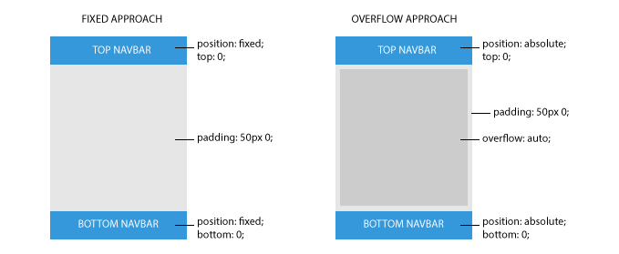
It uses scrollable areas to avoid scroll issues. In the following figure you can see the difference between fixed navbars and navbars with absolute positioning.
Here is the basic markup to achieve this.
<div class="app">
  <div class="navbar navbar-app navbar-absolute-top">
    <!-- ... -->
  </div>

  <div class="navbar navbar-app navbar-absolute-bottom">
    <!-- ... -->
  </div>

  <div class="app-body">
    <ng-view></ng-view>
  </div>
</div>
As you can notice the base class is .navbar-app while the positioning is obtained adding either .navbar-absolute-top or .navbar-absolute-bottom class.
Mobile Navbar Layout
Top navbar in mobile design most of the times follows a clear pattern: a centered title surrounded by one or two action buttons, the back or the menu buttons are two common examples.
Twitter Bootstrap ships with a different arrangement of components for navbars since they are supposed to host an horizontal navigation menu.
.navbar-app is specifically designed to support this different type of interaction and arrangement.
Consider the following example:
<div class="navbar navbar-app navbar-absolute-top">

  <div class="navbar-brand navbar-brand-center">
    Navbar Brand
  </div>

  <div class="btn-group pull-left">
    <div class="btn btn-navbar">
      Left Action
    </div>
  </div>

  <div class="btn-group pull-right">
    <div class="btn btn-navbar">
      Right Action
    </div>
  </div>
</div>
As you can see the markup is pretty straightforward: there is a .navbar-brand with its new specification, .navbar-brand-center, that will render the title centered and below the two button groups. Note that .navbar-brand-center will position the title with absolute positioning ensuring that it will never cover the buttons, which would cause interaction problems.
Sidebars
<div class="sidebar sidebar-left" toggleable parent-active-class="sidebar-left-in" id="mainSidebar">

<h1 class="app-name">Mobile Angular UI</h1>

<div class="scrollable">
  <div class="scrollable-content">
    <div class="list-group" toggle="off" bubble target="mainSidebar">
      <a class="list-group-item" href="#/">Home <i class="fa fa-chevron-right pull-right"></i></a>
      <a class="list-group-item" href="#/scroll">Scroll <i class="fa fa-chevron-right pull-right"></i></a>
      <a class="list-group-item" href="#/toggle">Toggle <i class="fa fa-chevron-right pull-right"></i></a>
      <a class="list-group-item" href="#/tabs">Tabs <i class="fa fa-chevron-right pull-right"></i></a>
      <a class="list-group-item" href="#/accordion">Accordion <i class="fa fa-chevron-right pull-right"></i></a>
      <a class="list-group-item" href="#/overlay">Overlay <i class="fa fa-chevron-right pull-right"></i></a>
      <a class="list-group-item" href="#/forms">Forms <i class="fa fa-chevron-right pull-right"></i></a>
    </div>

  </div>
</div>

</div>
As you can see sidebars can be placed either in left side or right side adding respectively .sidebar-left and .sidebar-right classes.
You should also notice that a sidebar is a toggleable. A sidebar is shown when parent has the .sidebar-[left|right]-in class moving the above .app element left or right. .sidebar and .app are supposed to be siblings.
The purpose of the toggle directive for .list-group is to make the sidebar disappear when a link is clicked or tapped, the bubble parameter is infact used to let click events be propagated to inner links.
<div class="list-group" toggle="off" bubble target="mainSidebar">
  <!-- ... -->
</div>
Sidebars can be toggled using the toggle directive either as an attribute or programmatically via toggle('sidebarId')
<div class="btn-group pull-left">
  <div ng-click="toggle('mainSidebar')" class="btn btn-navbar sidebar-toggle">
    <i class="fa fa-bars"></i> Menu
  </div>
</div>
By default sidebar are closed by clicking/tapping outside them. To prevent this behavior just add close-on-outer-clicks='false' to .sidebar element.
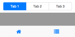
Tabs
Tabs component is realized via toggle and toggleable directives using exclusion-group parameter to inactivate other tabs but the active one.
<ul class="nav nav-tabs">
  <li><a href="#Tab1" toggle="on" parent-active-class="active">Tab 1</a></li>
  <li><a href="#Tab2" toggle="on" parent-active-class="active">Tab 2</a></li>
  <li><a href="#Tab3" toggle="on" parent-active-class="active">Tab 3</a></li>
</ul>

<div class="tab-content">
  <div class="tab-pane"
      toggleable
      active-class="active"
      default="active"
      id="Tab1"
      exclusion-group="myTabs">

    <h3 class="page-header">Tab 1</h3>
    <p><!-- ... --></p>
  </div>

  <div class="tab-pane"
      toggleable
      active-class="active"
      id="Tab2"
      exclusion-group="myTabs">
    <h3 class="page-header">Tab 2</h3>
    <p><!-- ... --></p>
  </div>

  <div class="tab-pane"
      toggleable
      active-class="active"
      id="Tab3"
      exclusion-group="myTabs">
    <h3 class="page-header">Tab 3</h3>
    <p><!-- ... --></p>
  </div>
</div>

<div class="btn-group justified nav-tabs">
  <a class="btn btn-default"
     href="#Tab1"
     toggle="on"
     active-class="active">Tab 1
  </a>

  <a class="btn btn-default"
     href="#Tab2"
     toggle="on"
     active-class="active">Tab 2
  </a>

  <a class="btn btn-default"
     href="#Tab3"
     toggle="on"
     active-class="active">Tab 3
  </a>

</div>
Accordion and Collapse
Accordion component is achieved via toggle and toggleable directives. exclusion-group parameter is used to inactivate other panels but the active one.
<div class="panel-group" id="accordion">
  <div class="panel panel-default">
    <div class="panel-heading" toggle target="collapseOne">
      <h4 class="panel-title">
          Collapsible Group Item #1
      </h4>
    </div>
    <div id="collapseOne" toggleable active-class="in" exclusion-group="accordion1" default="active" class="panel-collapse collapse">
      <div class="panel-body">
        <!-- ... -->
      </div>
    </div>
  </div>
  <div class="panel panel-default">
    <div class="panel-heading" toggle target="collapseTwo">
      <h4 class="panel-title">
          Collapsible Group Item #2
      </h4>
    </div>
    <div id="collapseTwo" toggleable active-class="in" exclusion-group="accordion1" class="panel-collapse collapse">
      <div class="panel-body">
        <!-- ... -->
      </div>
    </div>
  </div>
  <div class="panel panel-default">
    <div class="panel-heading" toggle target="collapseThree">
      <h4 class="panel-title">
          Collapsible Group Item #3
      </h4>
    </div>
    <div id="collapseThree" toggleable active-class="in" exclusion-group="accordion1" class="panel-collapse collapse">
      <div class="panel-body">
        <!-- ... -->
      </div>
    </div>
  </div>
</div>
Overlays
Overlay are similar to modals but looks more native in mobile devices.
This is the basic markup for an overlay. An overlay directive implicitly sets up a toggleable using its argument as id.
<div overlay="myOverlay">
  <h4 class="overlay-title">My Overlay</h4>
  <p>
    Lorem ipsum dolor sit amet, consectetur adipisicing elit. Dolorem, ex eaque possimus ipsa ab quasi quos corporis consequatur laudantium? Ab assumenda delectus quo velit voluptates doloribus. Earum odit facilis qui.
  </p>
  <p toggle="off" bubble target="myOverlay">
    <span class="btn btn-primary">Ok</span>
    <span class="btn btn-default">Cancel</span>
  </p>
</div>
You can show an overlay by default adding default='active' to the [overlay] element.
To interact with overlays from controllers you can use $rootScope.toggle() function: i.e $rootScope.toggle('myOverlay', 'on'); or $rootScope.toggle('myOverlay', 'off');.
Dropdowns
Dropdowns are also achieved using toggle and toggleable.
<div class="btn-group pull-right toggleable-dropdown" active-class="open" id="myDropdown" toggleable>
  <button type="button"
    class="btn btn-default dropdown-toggle" toggle
    target="myDropdown">
    <i class="fa fa-gear"></i> <span class="caret"></span>
  </button>
  <ul class="dropdown-menu" role="menu" toggle="off" bubble target="myDropdown">
    <li><a href>Action</a></li>
    <li><a href>Another action</a></li>
    <li><a href>Something else here</a></li>
    <li class="divider"></li>
    <li><a href>Separated link</a></li>
  </ul>
</div>
Carousels
Carousels have the same markup of bootstrap but their behaviour is achieved with 2 functions available to $rootScope: carouselPrev(id) and carouselNext(id).
This is a basic example that uses ngSwipeLeft and ngSwipeRight from ngTouch.
<div id="carousel-example" class="carousel">
      <div class="carousel-inner" ng-swipe-left="carouselPrev('carousel-example')"
      ng-swipe-right="carouselNext('carousel-example')">
        <div href="" class="item active">
          <div class="carousel-example-content">1</div>
        </div>
        <div href="" class="item">
          <div class="carousel-example-content">2</div>
        </div>
        <div href="" class="item">
          <div class="carousel-example-content">3</div>
        </div>
      </div>
</div>
To create more fancy effects and touch friendly experience you can use $swipe service direclty. $swipe service is provided by angular-touch.
This is a more complete example to explain how to build a swipe friendly carousel.
<div id="carousel-example" class="carousel">
      <div class="carousel-inner">
        <div href="" class="item active" carousel-example-item>
          <div class="carousel-example-content">1
            <br/><small>Swipe me!</small>
          </div>
        </div>
        <div href="" class="item" carousel-example-item>
          <div class="carousel-example-content">2
            <br/><small>Swipe me!</small>
          </div>
        </div>
        <div href="" class="item" carousel-example-item>
          <div class="carousel-example-content">3
            <br/><small>Swipe me!</small>
          </div>
        </div>
      </div>
</div>
Lets define the carouselExampleItem directive.
app.directive( "carouselExampleItem", function($rootScope, $swipe){
  return function(scope, element, attrs){
      var startX = null;
      var startY = null;
      var endAction = "cancel";
      var carouselId = element.parent().parent().attr("id");

      var translateAndRotate = function(x, y, z, deg){
        element[0].style["-webkit-transform"] = "translate3d("+x+"px,"+ y +"px," + z + "px) rotate("+ deg +"deg)";
        element[0].style["-moz-transform"] = "translate3d("+x+"px," + y +"px," + z + "px) rotate("+ deg +"deg)";
        element[0].style["-ms-transform"] = "translate3d("+x+"px," + y + "px," + z + "px) rotate("+ deg +"deg)";
        element[0].style["-o-transform"] = "translate3d("+x+"px," + y  + "px," + z + "px) rotate("+ deg +"deg)";
        element[0].style["transform"] = "translate3d("+x+"px," + y + "px," + z + "px) rotate("+ deg +"deg)";
      }

      $swipe.bind(element, {
        start: function(coords) {
          endAction = null;
          startX = coords.x;
          startY = coords.y;
        },

        cancel: function(e) {
          endAction = null;
          translateAndRotate(0, 0, 0, 0);
          e.stopPropagation();
        },

        end: function(coords, e) {
          if (endAction == "prev") {
            $rootScope.carouselPrev(carouselId);
          } else if (endAction == "next") {
            $rootScope.carouselNext(carouselId);
          }
          translateAndRotate(0, 0, 0, 0);
          e.stopPropagation();
        },

        move: function(coords) {
          if( startX != null) {
            var deltaX = coords.x - startX;
            var deltaXRatio = deltaX / element[0].clientWidth;
            if (deltaXRatio > 0.3) {
              endAction = "next";
            } else if (deltaXRatio < -0.3){
              endAction = "prev";
            } else {
              endAction = null;
            }
            translateAndRotate(deltaXRatio * 200, 0, 0, deltaXRatio * 15);
          }
        }
      });
    }
});
Now swiping items we will see them moving and rotating. When releasing an item if the swipe lenght was at least 3/10 of the item width then carouselPrev/carouselNext are invoked according to swipe direction.
Toggle Switch

The switch directive (not to be confused with ng-switch) lets you create a toggle switch control bound to a boolean ngModel value.
It requires ngModel. You can also use ngChange in conjunction with [switch] to trigger functions in response to model changes.
<switch ng-model="invoice.paid"></switch>
Utils
Justified Blocks
Mobile screens are small and it's common to have 2 or three buttons justified. To achieve this behaviour you can use the .justified class in any parent block of a group of items. This will apply a table layout to parent and a table-cell layout to its children.
Example:
<div class="btn-group justified nav-tabs">
  <a class="btn">Tab 1</a>
  <a class="btn">Tab 2</a>
  <a class="btn">Tab 3</a>
</div>
Form helpers
Mobile angular Ui provides some markup savers to create form inputs.
bs-form-control
NOTE: former bs-input.
<input
 bs-form-control

 type="text"
 ng-model="invoice.customer"
 label="Customer"
 label-class="col-xs-3 col-sm-2 col-lg-1"
 class="col-xs-9 col-sm-10 col-lg-11"
 placeholder="Customer Name"
/>
That translates to
<div class="form-group row">
  <label for="invoice_customer_input" class="control-label col-xs-3 col-sm-2 col-lg-1" />Customer</label>
  <div class="form-control-wrapper col-xs-9 col-sm-10 col-lg-11">
    <input type="text" ng-model="invoice.customer" class="form-control" placeholder="Customer Name" id="invoice_customer_input" />
  </div>
</div>
If you don't assing a grid class to label or element they will get .col-xs-12. This way you're always able to mix horizontal and vertical controls without the need to use form-horizontal or change markup and style.
Note that this directive only wraps target element with some html. This lets you apply it to any type of control, even custom one.
So for instance you can apply it to textarea or switch as well.
<switch            ng-model="invoice.paid"     label="Paid" bs-form-control></switch>
<textarea type="text" ng-model="customer.mailing_address" label="Address" bs-form-control></textarea>
Panel Helpers
bs-panel
A super simple directive minimizing the markup to use bootstrap panels.
<div bs-panel title="My Panel">
  <!-- Content -->
</div>
That translates to
<div class="panel">
  <div class="panel-heading">
    <h2 class="panel-title">
      My Panel
    </h2>
  </div>
  <div class="panel-body">
     <!-- Content -->
  </div>
</div>