Bootstrap default navbars are awesome for responsive websites, but are not the best with a small screen. Also fixed positioning is yet not an option to create navbars standing in top or bottom of the screen.
Mobile Angular Ui offers an alternative to bootstrap navbars that is more suitable for mobile.
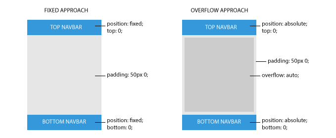
It uses scrollable areas to avoid scroll issues. In the following figure you can see the difference between fixed navbars and navbars with absolute positioning.
Here is the basic markup to achieve this.
<div class="app">
  <div class="navbar navbar-app navbar-absolute-top">
    <!-- ... -->
  </div>

  <div class="navbar navbar-app navbar-absolute-bottom">
    <!-- ... -->
  </div>

  <div class="app-body">
    <ng-view></ng-view>
  </div>
</div>
As you can notice the base class is .navbar-app while the positioning is obtained adding either .navbar-absolute-top or .navbar-absolute-bottom class.
Mobile Navbar Layout
Top navbar in mobile design most of the times follows a clear pattern: a centered title surrounded by one or two action buttons, the back or the menu buttons are two common examples.
Twitter Bootstrap ships with a different arrangement of components for navbars since they are supposed to host an horizontal navigation menu.
.navbar-app is specifically designed to support this different type of `.interaction and arrangement.
Consider the following example:
<div class="navbar navbar-app navbar-absolute-top">

  <div class="navbar-brand navbar-brand-center">
    Navbar Brand
  </div>

  <div class="btn-group pull-left">
    <div class="btn btn-navbar">
      Left Action
    </div>
  </div>

  <div class="btn-group pull-right">
    <div class="btn btn-navbar">
      Right Action
    </div>
  </div>
</div>
.navbar-brand-center is a specialization of BS3's .navbar-brand. It will render the title centered and below the two button groups. Note that .navbar- brand-center will position the title with absolute positioning ensuring that it will never cover the buttons, which would cause interaction problems.
Directives
navbarAbsoluteTop directive
Setup absolute positioned top navbar.
 <div class="navbar navbar-app navbar-absolute-top">
   <!-- ... -->
 </div>
navbarAbsoluteBottom directive
Setup absolute positioned bottom navbar.
 <div class="navbar navbar-app navbar-absolute-bottom">
   <!-- ... -->
 </div>
comments powered by Disqus